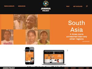
 Wow. If you haven’t stopped by…
in the last day or two, I’m guessing you won’t even recognize the place. It’s WAY cleaner, WAY cooler, instantly responsive, and radically simplified. I’m still trying to learn some of the new push button strategies. For example, in the People Group Listings, it took me a while to figure out that I had to have at least one button turned “green” in each category or else the listing would come back zero. But I figured it out after a few minutes and I know you will too… and then, I bet these pages stay very active — and gets LOTS of looks — because it’s sure a gorgeous interface. Well done, guys!


We at Joshua Project are exit to offer this new website which we pray will inspire and equip more toward frontier missions to unreached people groups!